Pixil AB
Visual identity and a complete brand system for Pixil AB — a Swedish tech company built for precision and growth.
- Brand strategy
- Logo (6 variants)
- Colour & typography
- Web design
- Pitch deck
- Client
- Pixil AB
- Country
- Sverige
- Year
- 2025
Logo
6 constructions
Brand guide
20 pages
Identity
Pixel to facade
Background
Pixil AB is a Swedish tech company with ambitions to grow. They had a name, a vision, and the need for a graphic identity that communicates precision, modernity, and confidence at first glance.
The challenge
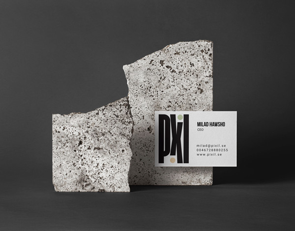
The Swedish tech scene is dominated by minimalist sans-serif logos in blue and grey. The challenge was a logo strong enough to stand alone as a glyph — recognisable on a business card, a facade sign, and a tote bag — without losing personality.
Strategy
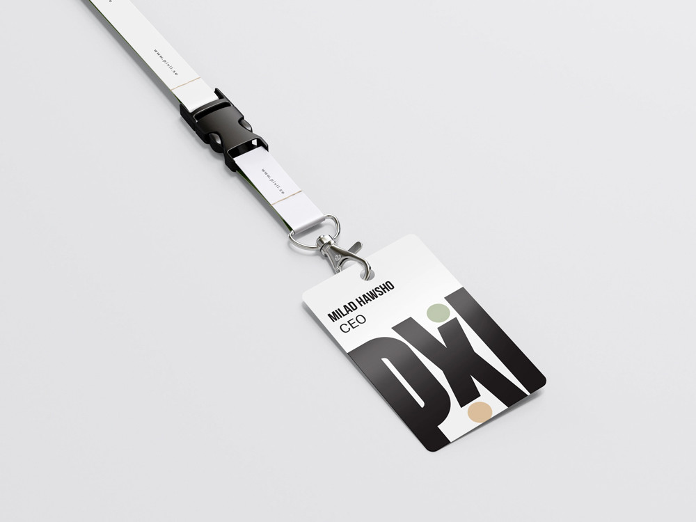
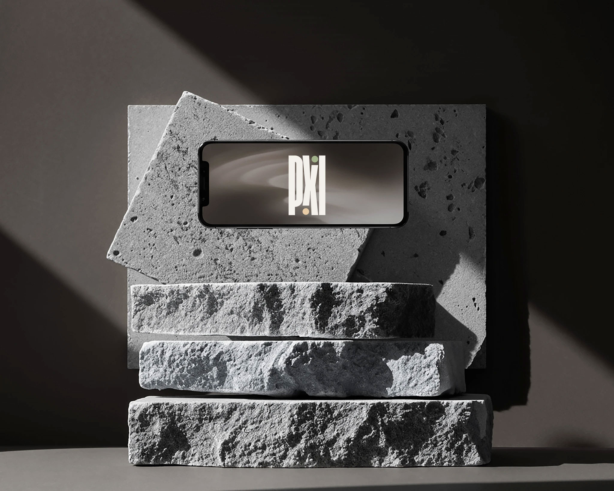
What should the logo say in half a second? Strength and playfulness. An X with two stacked I-forms creates a dynamic centre, and circular accent dots — like pixels in motion — give the identity energy.
Visual system
Palette: Sage Green, Sandstone Beige, and Charcoal Gray. Typography: Bebas Neue Bold for headlines and Roboto for body. The logo comes in six construction variants for light and dark backgrounds.
The result
Pixil got a brand that stands apart — a logo as strong on a business card as on a facade sign — and a complete system built for long-term growth.
Deliverables
- Brand strategy & positioning
- Logo (6 variants)
- Colour palette
- Typography guidelines
- Business card, lanyard & ID card
- Tote bag
- Facade signage & wayfinding
- Pitch deck template
- Web design
- Brand guide (20 pages)


More projects