FEM Sverige AB
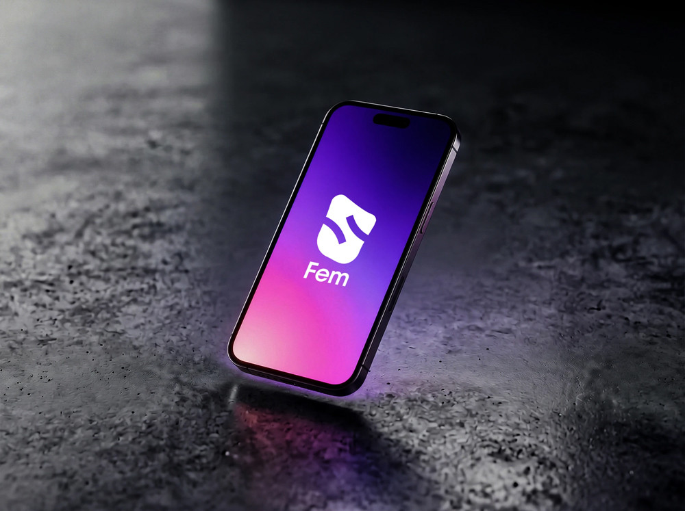
FEM Sverige operates in one of Sweden's most competitive industries. They had vision, an offering, and a name — but lacked the visual language needed against established telecom and IT competitors.
- Brand strategy
- Logo
- Colour & gradient system
- Typography
- Applications
- Client
- FEM Sverige AB
- Country
- Sverige
- Year
- 2025
Brand guide
30 pages
Applications
6 unique
Identity
Unified
Background
FEM Sverige needed a distinctive visual identity to launch successfully in a crowded telecom market dominated by established players.
The challenge
Most telecom brands communicate the same way — blue colours and tech-inspired shapes. The industry lacks distinction. The task was to convey FEM's core values and purpose.
Strategy
The core values: inclusion, collaboration, and simplicity. The logo — a hand symbolising contact, with five fingers for five services — was built on the golden ratio.
Visual system
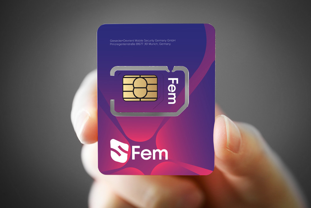
Royal Blue (#000088) as the primary colour, with Golden Glow, Vibrant Green, and Bold Red as accents. Gradients at -45°. Typography: Proxima Sera for headlines, Proxima Nova for body.
The result
The brand is functional, scalable, and built for long-term use — with a consistent identity across every platform and format.
Deliverables
- Brand strategy & positioning
- Logo design & construction
- Primary & accent palette
- Gradient system
- Typography guidelines
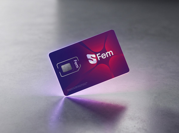
- SIM card design
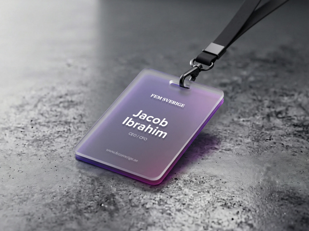
- Business card, lanyard & office signage
- Letterhead & document templates
- Presentation template
- Brand guide (30 pages)
More projects