Name, identity, and visual profile for a new pub concept in Linköping — from name strategy and design directions to finished logo and graphic profile.
Customer
The Mayor
_______________________
Sweden
Year
2025

Background
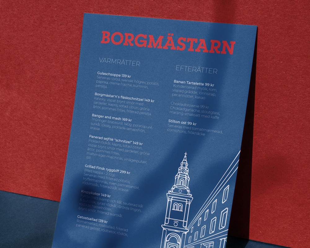
The Mayor is a new pub concept in Linköping with a clear offering: 140 beers and more. The clients came to OUF without an established name or visual identity — just a place, a passion for craft beer, and a strong sense of what the pub would mean to its guests. The mission was unusually broad: OUF would not only deliver a graphic profile but start from scratch and help shape the brand's soul, voice, and visual language from the ground up.
Challenge
Naming and building a brand simultaneously is a double challenge. The name must carry the identity — and the identity must reinforce the name. For a pub concept in the Swedish market, it was also important to avoid the generic pitfalls: neither too internationally anonymous nor too locally confined. The pub has a Czech cultural anchoring and a unique location on Borgmästaregatan with a view of Sankt Lars church — two concrete assets that design and name needed to fully embody, without feeling forced.
Strategy
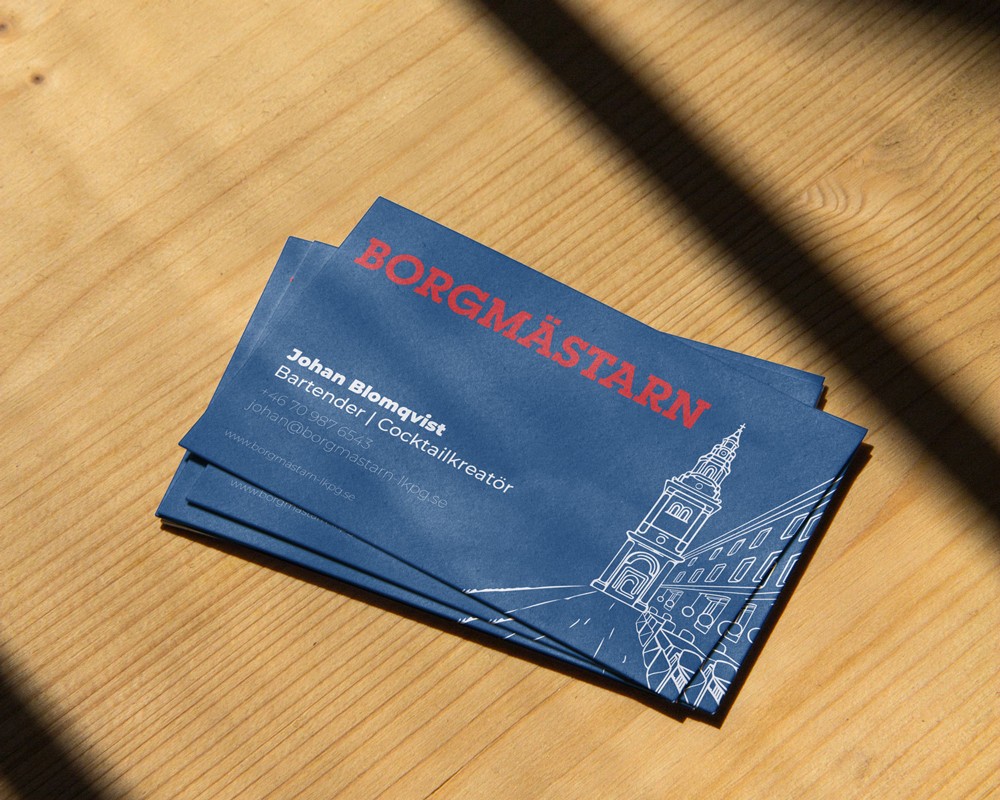
The work began with a structured naming process where OUF developed 14 distinct naming concepts with accompanying stories and moods — from playful word games to cultural hybrids and place-specific references. The Mayor was chosen for his dual foundation: the name refers directly to the street and its history, but also carries a warmth and authority that suits a pub with breadth and character. At the same time, four completely different design directions were presented — from Czech folklore influences to minimalist contour illustration and heraldic symbolism. The chosen direction integrated the actual silhouette of the street and the tower of St. Lars Church into a circular badge logo, with a red and blue color palette drawn directly from the Czech flag. Montserrat as a typography family balances tradition and accessibility.
1
1
Name concepts developed before the election
Name concepts developed before the election
2
2
Design directions presented for the client
Design directions presented for the client
3
3
Built from the ground up
Built from the ground up
Visual system
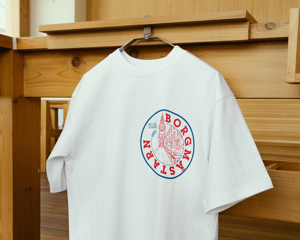
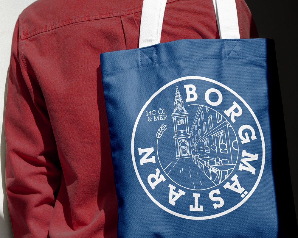
The logo is a circular badge featuring a hand-drawn line illustration of Mayor Street and St. Lars Church — the pub's actual view embedded in the badge itself. The name runs along the bottom edge of the circle in bold serif style, complemented by the tagline "140 BEERS & MORE" and a wheat spike as a decorative element. The color scheme is based on Crimson Red (#D6131A) and Navy Blue (#10457D) as core colors, with Onyx Gray (#2E2E2E) as a secondary color. The logo is available in four variants: full color, white, red monochromatic, and blue monochromatic. The website design was delivered as a Figma prototype with clean, bold typography and a clear navigation structure tailored for the pub's digital presence.
Result
The mayor went from a nameless concept to a brand with immediate local recognition and cultural weight. The logo literally carries the place within it. The identity is designed to work equally well embossed on a beer glass as a profile picture on social media, and the Czech color palette creates a visual connection to pub culture that is immediate and authentic.
Deliveries
Name strategy with 14 name concepts and associated stories, 4 design directions with mood boards and concept descriptions, primary logo (circular badge with illustration), 4 logo variants (full color, white, red, blue), color system with 3 defined brand colors (CMYK/RGB/HEX), typography system (Montserrat Light/Regular/Medium/Bold), brand guidelines with usage rules, website design as Figma prototype.
Latest projects


Name, identity, and visual profile for a new pub concept in Linköping — from name strategy and design directions to finished logo and graphic profile.
Customer
The Mayor
_______________________
Sweden
Year
2025
Background
The Mayor is a new pub concept in Linköping with a clear offering: 140 beers and more. The clients came to OUF without an established name or visual identity — just a place, a passion for craft beer, and a strong sense of what the pub would mean to its guests. The mission was unusually broad: OUF would not only deliver a graphic profile but start from scratch and help shape the brand's soul, voice, and visual language from the ground up.
Challenge
Naming and building a brand simultaneously is a double challenge. The name must carry the identity — and the identity must reinforce the name. For a pub concept in the Swedish market, it was also important to avoid the generic pitfalls: neither too internationally anonymous nor too locally confined. The pub has a Czech cultural anchoring and a unique location on Borgmästaregatan with a view of Sankt Lars church — two concrete assets that design and name needed to fully embody, without feeling forced.
Strategy
The work began with a structured naming process where OUF developed 14 distinct naming concepts with accompanying stories and moods — from playful word games to cultural hybrids and place-specific references. The Mayor was chosen for his dual foundation: the name refers directly to the street and its history, but also carries a warmth and authority that suits a pub with breadth and character. At the same time, four completely different design directions were presented — from Czech folklore influences to minimalist contour illustration and heraldic symbolism. The chosen direction integrated the actual silhouette of the street and the tower of St. Lars Church into a circular badge logo, with a red and blue color palette drawn directly from the Czech flag. Montserrat as a typography family balances tradition and accessibility.
1
1
Name concepts developed before the election
Name concepts developed before the election
2
2
Design directions presented for the client
Design directions presented for the client
3
3
Built from the ground up
Built from the ground up
Visual system
The logo is a circular badge featuring a hand-drawn line illustration of Mayor Street and St. Lars Church — the pub's actual view embedded in the badge itself. The name runs along the bottom edge of the circle in bold serif style, complemented by the tagline "140 BEERS & MORE" and a wheat spike as a decorative element. The color scheme is based on Crimson Red (#D6131A) and Navy Blue (#10457D) as core colors, with Onyx Gray (#2E2E2E) as a secondary color. The logo is available in four variants: full color, white, red monochromatic, and blue monochromatic. The website design was delivered as a Figma prototype with clean, bold typography and a clear navigation structure tailored for the pub's digital presence.
Result
The mayor went from a nameless concept to a brand with immediate local recognition and cultural weight. The logo literally carries the place within it. The identity is designed to work equally well embossed on a beer glass as a profile picture on social media, and the Czech color palette creates a visual connection to pub culture that is immediate and authentic.
Deliveries
Name strategy with 14 name concepts and associated stories, 4 design directions with mood boards and concept descriptions, primary logo (circular badge with illustration), 4 logo variants (full color, white, red, blue), color system with 3 defined brand colors (CMYK/RGB/HEX), typography system (Montserrat Light/Regular/Medium/Bold), brand guidelines with usage rules, website design as Figma prototype.
Latest projects