Visual identity & complete branding system for Pixil AB — logo, website, pitch deck, and profile materials
Customer
Pixil AB
_______________________
Sweden
Year
2025

Background
Pixil AB is a Swedish tech company with ambitions to grow — both as a product and as a brand. When we received the assignment, Pixil was a company with a name, a vision, and a clear need: a graphic identity that communicated precision, modernity, and confidence at first glance.
It wasn't about looking like a tech company. It was about building a brand that truly reflected what Pixil is — distinct, bold, and built to scale.


Challenge
The tech industry in Sweden is full of brands that all communicate in the same way. Minimalistic logos in sans-serif, blue or gray color palettes, generic websites with stock photos. The result is an industry where no one really stands out — and where a new company with the right identity has a real opportunity to visually own its category.
The challenge for Pixil was to create a logo design that was strong enough to stand alone as a glyph — recognizable on a business card, a facade sign, and a tote bag at the same time — without losing either personality or professionalism.
Strategy
We started with the simplest possible question: what should this logo communicate in half a second?
The answer boiled down to two words: strength and playfulness. Pixil is a tech company with precision — but also with energy and boldness. This led us to a logo concept based on pure geometry with an unexpected twist. By merging X with two stacked I shapes, a dynamic center is created. The circular accent points — placed like pixels in motion — break up the rigidity of the structure and give the identity a playful energy that separates Pixil from its competitors.
The contrast between strong geometry and soft rounded details is intentional. It is uncompromisingly strong but never cold.
6
6
Logo designs
Logo designs
20
20
Pages brand guide
Pages brand guide
1
1
Consistent identity from pixel to facade
Consistent identity from pixel to facade
Visual system
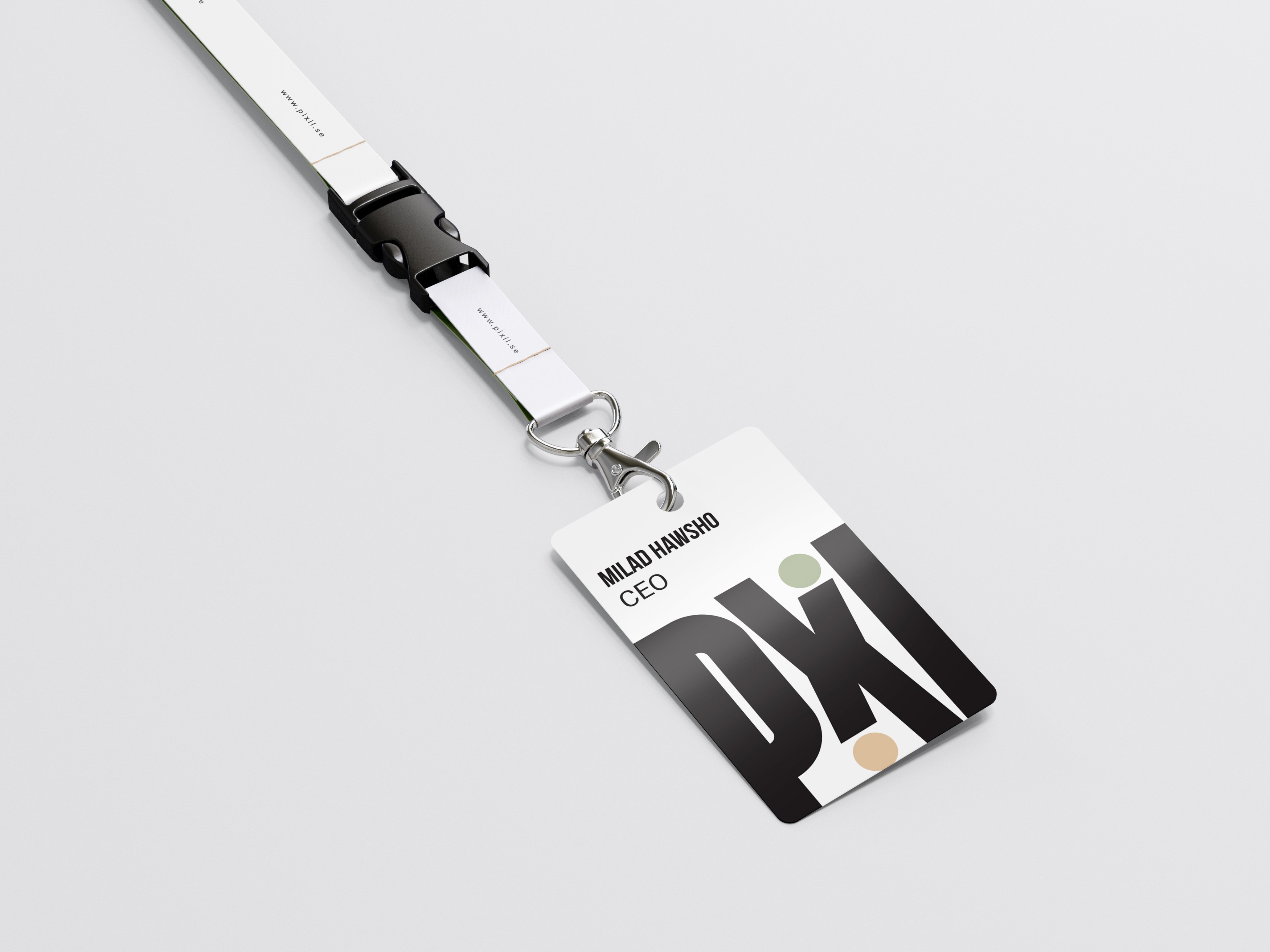
The color palette is built around three carefully selected colors. Sage Green (#A2B08C) as the primary color — organic, calm, and distinct enough to be owned by a single brand in the tech segment. Sandstone Beige (#E9CBA7) as the secondary color for warmth and contrast. Charcoal Gray (#2E2E2E) as the base — deep and authoritative without being black.
The typography combines Bebas Neue Bold for headlines — compressed, powerful and with a presence that is visible from a distance — with Roboto for body text in Regular, Medium, and Bold. The contrast between the two creates a clear hierarchy that works equally well in a pitch deck as it does on a webpage.
The logo is designed for ultimate flexibility — 6 construction variants on light and dark backgrounds, in Sage Green, Sandstone, and Charcoal. From compact icon for social media to large-scale facade signage and wayfinding. Each variant is certified for its context and documented in the brand guide.
The applications range from business cards on granite substrates and branded tote bags to complete office signage, wayfinding systems with directional arrows, lanyards, and a complete pitch deck template — all in one and the same visual language.

Result
Pixil received a brand that does not look like its competitors. A logo that is as strong as a glyph on a business card as it is on a facade sign three meters up on a wall. A complete visual system that Pixil can grow into over a long time — without ever needing to start over.
That is what a well-thought-out graphic identity and professional brand design actually do for a company. Not just impressing in a meeting — but building recognition day after day, touchpoint after touchpoint.
Deliveries
Brand strategy & positioning · Logo design with 6 construction variants · Color palette (Sage Green, Sandstone Beige, Charcoal Gray) · Typography guidelines (Bebas Neue + Roboto) · Business cards · Lanyard & ID card · Tote bag · Facade sign & wayfinding system · Pitch deck template · Package structure document · Web design · Brand guide (20 pages)
Latest projects


Visual identity & complete branding system for Pixil AB — logo, website, pitch deck, and profile materials
Customer
Pixil AB
_______________________
Sweden
Year
2025
Background
Pixil AB is a Swedish tech company with ambitions to grow — both as a product and as a brand. When we received the assignment, Pixil was a company with a name, a vision, and a clear need: a graphic identity that communicated precision, modernity, and confidence at first glance.
It wasn't about looking like a tech company. It was about building a brand that truly reflected what Pixil is — distinct, bold, and built to scale.
Challenge
The tech industry in Sweden is full of brands that all communicate in the same way. Minimalistic logos in sans-serif, blue or gray color palettes, generic websites with stock photos. The result is an industry where no one really stands out — and where a new company with the right identity has a real opportunity to visually own its category.
The challenge for Pixil was to create a logo design that was strong enough to stand alone as a glyph — recognizable on a business card, a facade sign, and a tote bag at the same time — without losing either personality or professionalism.
Strategy
We started with the simplest possible question: what should this logo communicate in half a second?
The answer boiled down to two words: strength and playfulness. Pixil is a tech company with precision — but also with energy and boldness. This led us to a logo concept based on pure geometry with an unexpected twist. By merging X with two stacked I shapes, a dynamic center is created. The circular accent points — placed like pixels in motion — break up the rigidity of the structure and give the identity a playful energy that separates Pixil from its competitors.
The contrast between strong geometry and soft rounded details is intentional. It is uncompromisingly strong but never cold.
6
6
Logo designs
Logo designs
20
20
Pages brand guide
Pages brand guide
1
1
Consistent identity from pixel to facade
Consistent identity from pixel to facade
Visual system
The color palette is built around three carefully selected colors. Sage Green (#A2B08C) as the primary color — organic, calm, and distinct enough to be owned by a single brand in the tech segment. Sandstone Beige (#E9CBA7) as the secondary color for warmth and contrast. Charcoal Gray (#2E2E2E) as the base — deep and authoritative without being black.
The typography combines Bebas Neue Bold for headlines — compressed, powerful and with a presence that is visible from a distance — with Roboto for body text in Regular, Medium, and Bold. The contrast between the two creates a clear hierarchy that works equally well in a pitch deck as it does on a webpage.
The logo is designed for ultimate flexibility — 6 construction variants on light and dark backgrounds, in Sage Green, Sandstone, and Charcoal. From compact icon for social media to large-scale facade signage and wayfinding. Each variant is certified for its context and documented in the brand guide.
The applications range from business cards on granite substrates and branded tote bags to complete office signage, wayfinding systems with directional arrows, lanyards, and a complete pitch deck template — all in one and the same visual language.
Result
Pixil received a brand that does not look like its competitors. A logo that is as strong as a glyph on a business card as it is on a facade sign three meters up on a wall. A complete visual system that Pixil can grow into over a long time — without ever needing to start over.
That is what a well-thought-out graphic identity and professional brand design actually do for a company. Not just impressing in a meeting — but building recognition day after day, touchpoint after touchpoint.
Deliveries
Brand strategy & positioning · Logo design with 6 construction variants · Color palette (Sage Green, Sandstone Beige, Charcoal Gray) · Typography guidelines (Bebas Neue + Roboto) · Business cards · Lanyard & ID card · Tote bag · Facade sign & wayfinding system · Pitch deck template · Package structure document · Web design · Brand guide (20 pages)
Latest projects