Logo & visual identity system for Swedish telecommunications and IT operator
Customer
FEM Sweden AB
_______________________
Sweden
Year
2025

Background
FEM Sweden operates in one of Sweden's most competitive industries. Telecommunications and IT solutions are an area filled with established players with large budgets and even greater recognition. Launching a new company in that landscape without a distinct identity is not only difficult — it is impossible.
The mission came early. FEM Sweden had a vision, an offer, and a name. What they lacked was a visual language that could carry everything forward.
Challenge
Most telecommunications brands communicate in the same way. Blue colors, technology-inspired shapes, promises of speed and reliability. The result is an industry where everyone looks alike — and where no one really stands out.
Our challenge was not just to design something that looked good. It was to find a visual identity that actually said something — about what FEM Sweden is, what they believe in, and why they exist.
Strategy
Before we opened a single design program, we asked the questions that truly determine everything: What should this brand communicate? To whom? In what context does the customer encounter it?
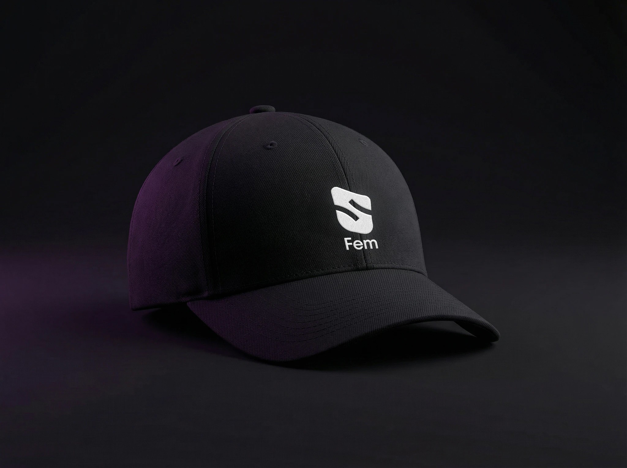
FEM Sweden's core values landed in three words: inclusion, collaboration, and simplicity. One contact, multiple services. From there, the logo concept came naturally — the hand as the universal symbol of contact. Five fingers. Five services. Constructed with the proportions of the golden ratio for timeless balance.
30
30
Sidor brand guidelines
Sidor brand guidelines
6
6
Unique applications
Unique applications
1
1
Unified brand identity
Unified brand identity
Visual system
A logo is a starting point, not a brand. What we built was a complete visual system that holds together no matter where it is used.
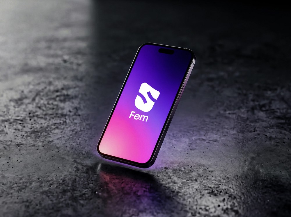
Royal Blue (#000088) as the primary color — deep, authoritative, and distinct enough to actually be owned by a brand. Accent colors in Golden Glow, Vibrant Green, and Bold Red for dynamism in campaigns and digital material. Gradients applied at a -45° angle for movement without instability.
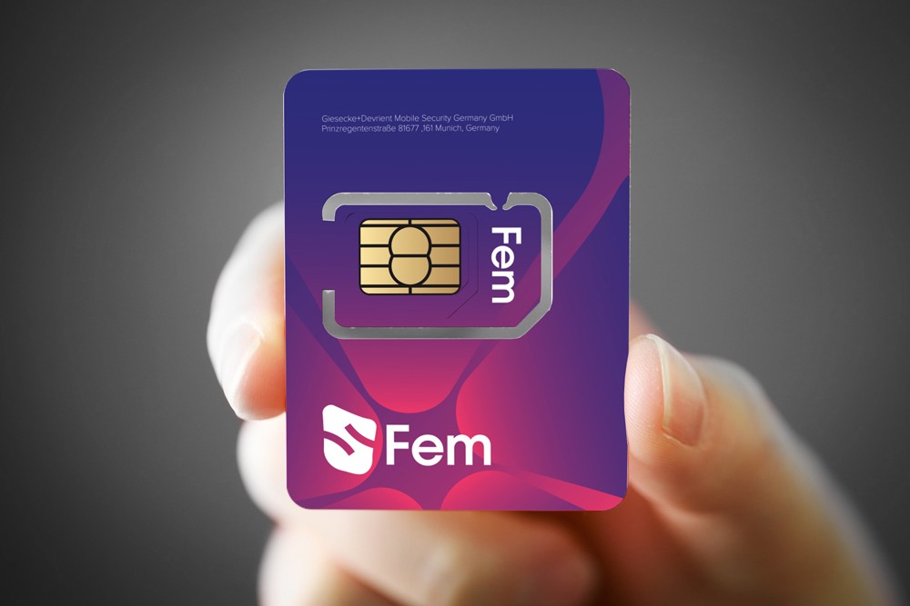
Proxima Sera for headlines — authoritative and characterful. Proxima Nova for body text — clean and extremely readable in all sizes. Together they create a hierarchy that works from a SIM card's mini format to a full-scale presentation.
Result
The final brand is functional, scalable, and built to carry a company over the long term. Every touchpoint feels like it comes from the same place — because it does.
FEM Sweden transitioned from a company with a name to a brand with a presence. Distinct enough to be visible. Consistent enough to build trust. Human enough to actually touch.
Deliveries
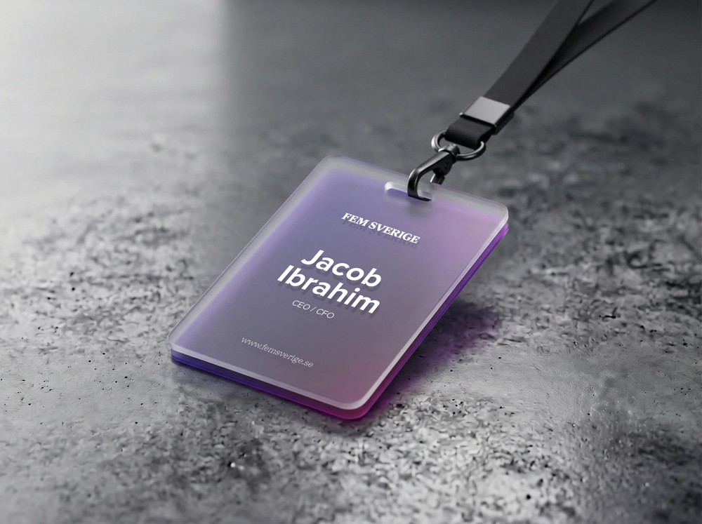
Brand strategy & positioning · Logo design & construction · Primary and accent color palette · Gradient system · Typography guidelines · SIM card design · Business cards & lanyard · Office signage · Letterhead & document templates · Presentation template · Brand guide (30 pages)
Latest projects


Logo & visual identity system for Swedish telecommunications and IT operator
Customer
FEM Sweden AB
_______________________
Sweden
Year
2025
Background
FEM Sweden operates in one of Sweden's most competitive industries. Telecommunications and IT solutions are an area filled with established players with large budgets and even greater recognition. Launching a new company in that landscape without a distinct identity is not only difficult — it is impossible.
The mission came early. FEM Sweden had a vision, an offer, and a name. What they lacked was a visual language that could carry everything forward.
Challenge
Most telecommunications brands communicate in the same way. Blue colors, technology-inspired shapes, promises of speed and reliability. The result is an industry where everyone looks alike — and where no one really stands out.
Our challenge was not just to design something that looked good. It was to find a visual identity that actually said something — about what FEM Sweden is, what they believe in, and why they exist.
Strategy
Before we opened a single design program, we asked the questions that truly determine everything: What should this brand communicate? To whom? In what context does the customer encounter it?
FEM Sweden's core values landed in three words: inclusion, collaboration, and simplicity. One contact, multiple services. From there, the logo concept came naturally — the hand as the universal symbol of contact. Five fingers. Five services. Constructed with the proportions of the golden ratio for timeless balance.
30
30
Sidor brand guidelines
Sidor brand guidelines
6
6
Unique applications
Unique applications
1
1
Unified brand identity
Unified brand identity
Visual system
A logo is a starting point, not a brand. What we built was a complete visual system that holds together no matter where it is used.
Royal Blue (#000088) as the primary color — deep, authoritative, and distinct enough to actually be owned by a brand. Accent colors in Golden Glow, Vibrant Green, and Bold Red for dynamism in campaigns and digital material. Gradients applied at a -45° angle for movement without instability.
Proxima Sera for headlines — authoritative and characterful. Proxima Nova for body text — clean and extremely readable in all sizes. Together they create a hierarchy that works from a SIM card's mini format to a full-scale presentation.
Result
The final brand is functional, scalable, and built to carry a company over the long term. Every touchpoint feels like it comes from the same place — because it does.
FEM Sweden transitioned from a company with a name to a brand with a presence. Distinct enough to be visible. Consistent enough to build trust. Human enough to actually touch.
Deliveries
Brand strategy & positioning · Logo design & construction · Primary and accent color palette · Gradient system · Typography guidelines · SIM card design · Business cards & lanyard · Office signage · Letterhead & document templates · Presentation template · Brand guide (30 pages)
Latest projects